From Problem to Launch: How to Turn Research Findings into Real Products
Nov 6, 2025

This is my second article in a series dedicated to design processes, and in it, we'll talk about the second diamond of the Double Diamond system and how we can now address the user pain point we've identified and turn our ideas into a living, simple, clear, and user-friendly product. Let's go!
In the first article, we identified the real problems and pain points of our users, as well as our technical, financial, and time constraints. Thanks to this, we acquired a reliable foundation for solving real problems, confirmed by real data.
Now it's time to move from problems to solutions. If the first diamond was about "What?" and "Why?", the second one is about "How?"
The second diamond also consists of two phases, potentially repeating infinitely until the right solution is found: Developand Deliver.
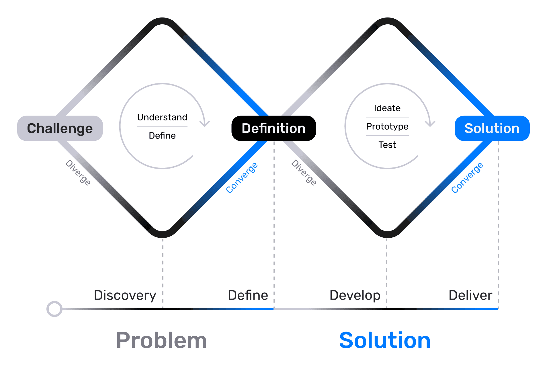
Develop
At this stage, our main task is to generate the maximum number of ideas and concepts that can solve the problems identified in the previous Define phase. The goal is to later select only the best solutions that meet all requirements and address the identified problems. There may be several good solutions, and in such cases, A/B testing can be used to determine the most effective one.
HMW Questions / "How Might We...?"
To start, we need to transform our key insights into questions based on those insights, framed as "How Might We...?"
Let's say, for example, we've been tasked with designing a promotional banner for "Ready-made Investment Portfolios" within a banking application, and we must ensure accessibility for people with disabilities (PWDs).
In the first research phase, we found that users with visual impairments often miss the old banner on the main capture screen, and users with cognitive impairments struggle to understand the content of the second screen. We created this second screen to comply with a law that prohibits creating a "False Banking Impression" and requires us to warn that "Profitability is not guaranteed" and "Investments are not insured by the DIA (Deposit Insurance Agency)" — based on Federal Law No. 177-FZ of December 23, 2003, "On Insurance of Deposits in Banks of the Russian Federation."
Example Insight: "PWDs with visual impairments find it difficult to spot the banner among other content."
Example HMW Questions:
"How Might We make the 'Ready-made Investment Portfolio' banner visually more contrasting and accessible for screen readers so that users with visual impairments do not miss it?"
"How Might We simplify the legal disclaimer on the first screen after the banner so that users with cognitive impairments can easily understand it?"
Such questions help us focus on our problem while leaving a huge scope for experimentation. We remember that we are only limited by technical constraints, deadlines, and potentially an overly large or impractical budget.
Once the HMW question is formed, you can use AI/neural networks to find out what ready-made solutions already exist on the market, what users are accustomed to, and what potential pitfalls and corner cases might arise. This is a very useful step; it helps us approach the brainstorming sessions much better prepared.
Here is my request structure for neural networks when a new task comes in:
[Context/Product] - [Task/Features] - [Possible Solutions/Best Practices/Pitfalls/Corner Cases] - [Our Role]
For example: We have a banking application that we are making accessible for people with disabilities (Context/Product), and we need to design a banner for a "Ready-made Investment Portfolio" to capture attention from the home page (Task/Features). Suggest possible solutions, highlight what to pay attention to, what the existing best practices are, what potential pitfalls and corner cases might exist, and describe how major market players have solved this problem (Possible Solutions/Best Practices/Pitfalls/Corner Cases). Remember that I am a Product Designer (Our Role).
I use these types of requests regularly, and despite all my experience, they are often genuinely helpful.
Brainstorming and Idea Generation (Ideation)
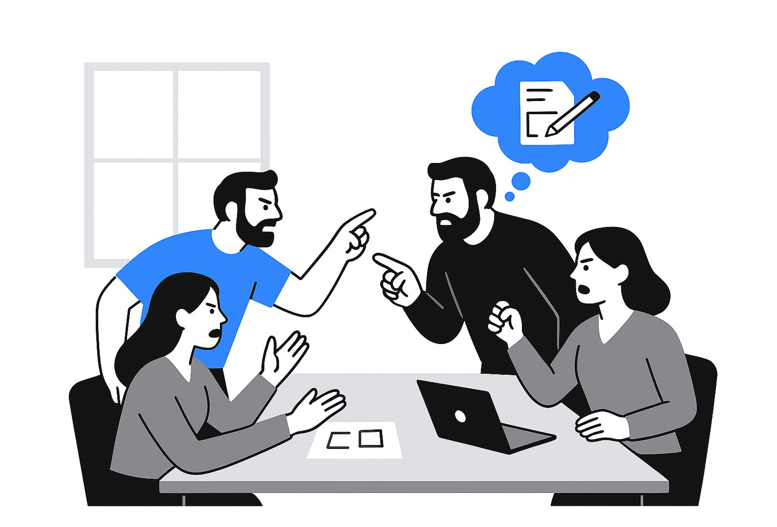
Now, our task is to conduct structured sessions with the team, involving everyone relevant to the development of our feature (developers, marketers, managers). It's worth mentioning that you should schedule discussions with everyone simultaneously, rather than holding separate brainstorms with development and separate ones with marketing. Diversity of perspectives is critical for us, and we want everyone to hear everyone else. We will use our established HMW questions as the entry point.
There are several methods for conducting brainstorms, here are the most popular ones: (If you notice that ideas are being poorly generated during the brainstorm, try combining methods right in the process by introducing participants to the new conditions):
Classic Brainstorming: Quantity over quality, no criticism allowed — just a flow of ideas.
Brainwriting: Ideas are written down silently to avoid the influence of the loudest or most authoritative voices.
Crazy 8’s: Rapid sketching of 8 ideas in 8 minutes to generate a high volume of concepts.
SCAMPER: A system of questions for the potential transformation of an existing product (where we ask questions about what we can: Substitute, Combine, Adapt, Modify/Magnify, Put to another use/Eliminate, Reverse/Rearrange).
Reverse Brainstorming: Sometimes you can use reverse logic and generate the most inconvenient solutions possible. By looking at them, we can more precisely understand which solutions we definitely want to avoid. Plus, such sessions help relieve emotional tension within the team. For example: "How would we make this banner maximally inaccessible?" You might often be surprised by what your colleagues come up with :)
The result should be a large wall in the office, a FigJam, or a Miro board filled with raw ideas and sketches, from the most obvious to the craziest.
In our example, we are focusing primarily on accessibility: We generate ideas that solve specific accessibility problems (e.g., different CTA options, various visual metaphors, alternative banner formats—not just a visual card, but also, for instance, an audio notification or a widget).
Selection and Prioritization of Solutions
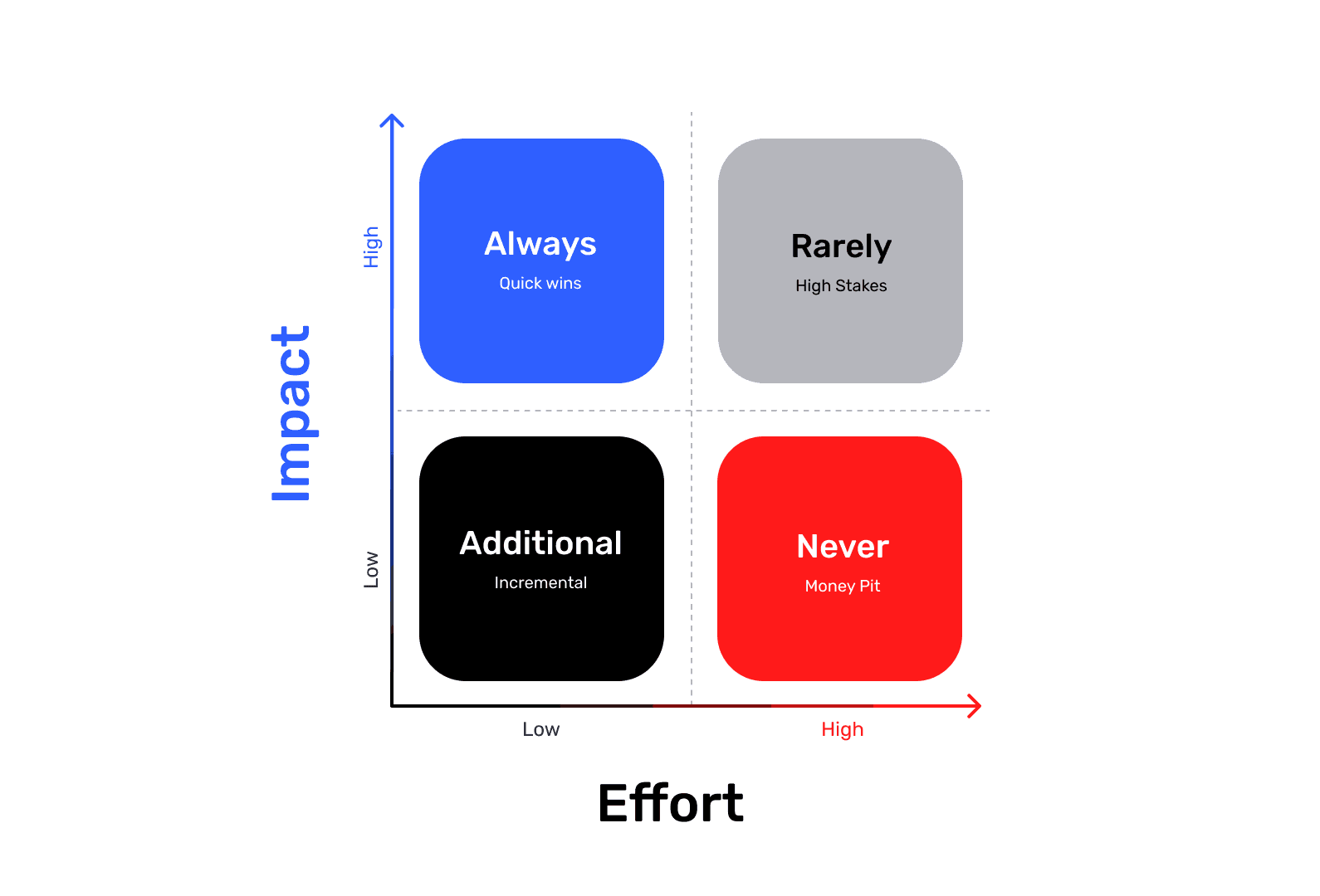
Impact vs. Effort, or Value vs. Complexity
Now we need to select a few of the most viable concepts for further development, and the prioritization matrix will be our main assistant here. Its primary task is to narrow down the multitude of ideas to a few implementable concepts and then, among them, identify the ideas that, in our example, will provide the greatest improvement in accessibility (Impact) with the lowest development cost (Effort).
It’s always important to remember the cognitive bias known as the planning fallacy, where we often view things too optimistically and anticipate shorter timelines despite past experience. Therefore, deadlines should always be estimated with a certain buffer. The main danger of incorrect time estimation is that we incorrectly define the concept's value, and the real effort on the chart will be shifted to the right. As a result, in real life, the concept should belong in the "Never" (Money Pit) quadrant, but we placed it in "Incremental" (Additional), putting it into one of the nearest sprints or placing it at the very top of the backlog. Alternatively, we might have placed it in "Quick Wins" (Always), when its true place is in "High Stakes" (Rarely), because despite the obvious benefit, we will have to spend significantly more effort to roll this concept out into production. The result: Wasted budget and team time on a non-priority task.
Sketches, Concepts, Storyboards
So, we have selected a few (usually 2-3) of the most promising concepts. Now we need to visualize them so they can be easily discussed and tested. It is important to consider the entire user journey (in our example, this should be the path from clicking the banner to making the actual investment). What tools can help us with this?
Interface Sketches: Quick, rough drafts of screens on paper or in Figma.
Storyboards or Customer Journey Maps: Drawing how the user will interact with our solution in the context of their story. We show how the solution fits into their life and solves their pain point.
User Flows: Tree-like diagrams that describe the entire user journey. I often see people trying to skip these during the development phase, which is a pity — in my opinion, this is one of the best ways to visualize all scenarios and algorithms. (Insights often come precisely when looking at these "leaves" on the tree, prompting thoughts like: "Oh! It seems we missed... at this step, and here the user will surely want to...")
Concept Maps or Mind Maps: Creating collages or diagrams that convey the "spirit" or core value of the idea. Used if other tools are insufficient for presentation and if user emotions are heavily involved in the problem-solving process.
WCAG Compliance: In our case, ideas should be evaluated for compliance with accessibility principles (WCAG) at this stage. Ideas with high potential for accessibility improvement should be prioritized.
The result: We should have 2-3 detailed, prioritized design concepts (for example, "Concept A: High-Contrast Banner with Large CTA" and "Concept B: Hidden Banner Activated by Screen Reader").
Forming Hypotheses
Having visualized our concepts, we need to form the hypotheses that we will test. Why do we do this? So that before the Deliver (Implementation) stage, we have ideas, concepts, and numerically verifiable hypotheses that potentially solve our problem. This way, we only have to narrow our focus and choose the best one later.
Hypothesis Structure:
We believe that [implementing this feature/change] For [this user group] Will result in [this specific outcome] We will be right if [we see this metric confirmation]
Example: "We believe that if we add a high-contrast banner with an enlarged click area (≥44×44 dp) and an explicitly marked ARIA-role for the button, users with visual impairments (using screen readers) and users with motor skill impairments will be able to successfully find and click the banner. We will be right if this leads to an increase in the banner's Conversion Rate (CR) from impression to click among the PWD segment by 20% and a decrease in customer support complaints about the element's inaccessibility by 50%."
Why do I use the numbers 20% and 50% in the example? These are realistic figures for our case. In reality, with a problem like this, we should close the click-rate (CR) gap between regular users and PWDs. If the regular banner CR is about 5%, our current banner likely has a CR close to 0% due to the inability to interact with it. So why do I set ambitious goals here, such as a minimum of 20%, when the regular user CR is only 5%? I always do this, and in this specific case, I do it because our solution removes a barrier for a key user group. And eliminating a barrier always leads to a much higher conversion growth than minor UX fixes, where growth is usually in the range of 2–5%. Plus, I am counting on the psychological effect of inclusivity, where people who previously could not use this element will successfully interact with it for the first time. The reduction in complaints should be even more impressive. I believe I will have succeeded with the task only if the number of complaints and bug reports related to inaccessibility decreases by at least 50%.
Hypotheses are very important to us because by forming them, we can move from "I think" to assertions verifiable by data.
Deliver (Delivery/Implementation)
We are approaching the finish line. Now is the time to test our design concepts, select the best ones, refine them, and prepare them for implementation.
Prototypes
The first thing we must create for any feature of even slight complexity is interactive prototypes. Depending on the task itself, prototypes can be:
Simple Low-Fidelity (Lo-Fi): They can consist only of schematic blocks of interface elements; their main goal is to show the structure and workflow.
Complex High-Fidelity (Hi-Fi): They look and function almost like the real product, with actual design, animation, and interactivity.
Depending on the complexity of the prototypes, you need to select the appropriate tools. For most prototypes, Figma's built-in prototyping features are sufficient, but for more complex ones (as in our case, where sound imitation of a screen reader is required), it is better to use ProtoPie.
It is very important to remember that any prototypes must be tested in "field conditions" to truly feel our solution. If we are designing a fitness application and need to design the screen during an exercise, we must get up and start doing the exercise before we begin testing our application.
This is because human behavior under different conditions will be completely different. For example, motor skills at a heart rate of 65 and 120+ are completely distinct for everyone. While we are designing neat and aesthetic buttons just sitting in front of our retina monitors, considering them perfect, during the actual exercise, we ourselves will want to make those buttons larger, or even leave only one, and never take it out of the thumb's tap zone.
User Testing
Before taking our prototypes to real users, we must ensure they pass our expert design review.
Contrast: Check text-on-background contrast for WCAG compliance (I use the "A11y - Color Contrast Checker" plugin in Figma).
Interactive Zones and Element Logic: Check all elements of our mockups. Review the content of headers (A header must always be unambiguous and clearly describe the content below; if the text length is unacceptable, we look for alternative options) and their hierarchy (H1-H2-H3-H4-H5). Check all input fields, the presence of all states for all elements, errors, links, buttons, labels, and notifications.
All elements must always be interpreted unambiguously, and the user must always understand where they are, what the system can offer them on the current screen, and what will happen if they start interacting with a particular element. There should be no situations where the user cannot predict our system's behavior, and especially no situations with false promises. (An example of a poor payment terminal interface is when the user stares at it for a long time and thinks: "Where the heck do I press, darn it!")
If we are creating a product accessible to all user groups, the A11y Annotation Kit can be used as a handy reference.
When creating prototypes in Figma, it is always better to use variables, interactive components, conditional logictied to variables, and of course, sections — since we can link a transition not to a separate frame but to an entire section, within which the necessary scenario will be executed across several frames (remember that the top-left frame is considered the starting frame within a section). This will help us reduce the size of our prototypes tenfold while keeping them interactive and retaining all interaction logic. For mockups with complex prototypes, it will also be useful to provide a description of states and interactions, just as you would for mockups intended for handover to development.
Once the prototypes have passed our expert design review, we can move on to the real user testing phase. Before this, it is good practice to test the prototypes within the team and let everyone "click through." Ideally, if real usage conditions can be reproduced, they should be simulated (remember the fitness app example). Insights come particularly often during the prototype review stage, and these steps must not be skipped.
A good case is to involve experts for prototype testing (in our example, we need experienced screen reader users).
Testing Scenario
Moderated testing is in some ways similar to user interviews, and its rules are largely alike. We also have a warm-up/introduction stage, where we must create a calm, comfortable environment and explain to the user that we are testing the interface, not them, and we need honest answers that will help improve the interaction in the future. We also, if possible, do not confess to being the designers on the project, but introduce ourselves as marketers or product managers. This is followed by the stage of hypothesis verification, corner case checking, feedback collection, and mandatory recording of success metrics.
Warm-up:
Establish rapport, make sure the respondent feels comfortable (set up screen/audio recording equipment beforehand), ask them to perform some habitual actions within the application, such as checking the balance on the main screen.
Critical Tasks and Hypothesis Verification:
Task 1 (Discovery): Formulate tasks without giving clues. At this stage, we try to find out how many steps (swipes/clicks) it took the user to find the banner? Did they walk past it?
Example: "Imagine you've decided to try investing a small amount for the first time, but you don't want to choose stocks yourself. Find the offer on the main screen that will help you start investing."
Task 2 (Understanding): We want to find out how well the user understands our interface, and whether we have any ambiguous or unnecessary elements that create additional cognitive load. In our example, we want to check all ARIA-labels: Did the screen reader clearly read the title and description? Were any extraneous or meaningless elements read?
Example: "Now that you have found this offer, please tell me exactly what your screen reader read. How did you understand that this is a 'Ready-made Investment Portfolio'?"
Task 3 (Interaction): At this stage, we find out how the interaction with interface elements occurs. In our example, we will check the accessibility (A11y) of our CTA: Was the button easily activated (especially when navigating with Tab or switch control)? Were there any erroneous taps?
Example: "Excellent. Please click on this offer to proceed."
Corner Cases:
Task 4 (Context Change): At this stage, we need to find out if new barriers appear when transitioning to new screens and ensure the user does not lose context. In our example, we will want to find out if the screen reader announced the new page title immediately after the transition?
Example: "You have moved to a new screen. Tell me how you understood what exactly changed. Where are you now?"
Task 5 (Alerts and Warnings): Depending on the task, we may have completely different warning screens, and we must find out that the language used is extremely simple and understandable to the user, and that these warnings do not have double meanings. In our example, we will want to find out if the warning is simple and accessible for the screen reader to read? Is it understandable to the user (especially those with cognitive impairments)?
Example: "There is an important legal warning about risks on this screen. Please find it and read out how it is worded."
Task 6 (Quitting): Always check the path for opting out and convenient closure. In our example, we will check the accessibility of the closing button: Was the "Back" / "Close" button easily found? Was its ARIA-label clear?
Example: "Imagine you've changed your mind. Please return to the main screen or close this offer."
Feedback
We absolutely must collect feedback — we are here for this very reason. We need insights and personal impressions. Ask the questions we are interested in:
"What was the simplest thing about using this banner/screen?"
"What was the most confusing or difficult?"
"Was there anything in the information read that made you hesitate or feel uncertain?"
"If you could change one thing about this banner, what would it be?"
Metrics
Collect metrics to get objective confirmation that our solution works and to identify new, previously unnoticed problems. The metrics we care about:
Success Rate: Was the user able to click successfully (Yes/No).
Time on Task: How long it took to discover the banner.
Errors: How many times the user mistakenly swiped past the banner or clicked the wrong element.
Also, record the user's verbatim comments about what they hear and think.
Iterations and Refinements
After receiving feedback, we return to our prototypes and make changes. This is a small cycle within the larger cycles, and if we are confident that the collected data is sufficient for further work, we follow this pattern:
Create Prototype → Test → Gather Insights → Refine and Polish
Our goal is to bring our solution to the greatest possible perfection within the allocated deadlines. In design, there is a concept called "Good enough" and deadlines for delivery to production, and often we have to decide what falls under this definition in our case. But that is a topic for a separate article; now we are talking about ideal conditions. If at this (or any other) stage we realize that we need more data for further work, we return to the previous stage where we believe there is a gap. This could be any stage, not only from the second "Solution" diamond but also from the first "Problem" diamond.
Final UI Kit and Design System
The time has come to assemble our mockups into the final versions and hand them over to development. This will all depend on whether you are creating something from scratch or using ready-made components from an existing design system, and on the approved design processes within your team. Whatever the case, here are a few tips for preparing mockups:
The design system is best built on Variables through a system of primitives-aliases-tokens with the default semantics of
component-category-state-role. There is an excellent tool for generating the semantics of your tokens: https://namedesigntokens.guide. It only becomes a fully-fledged design system when our UI-kit acquires descriptions of all components, and those components appear in the developers' code so that they can copy and paste them exactly where needed.All elements of the design system and the mockups themselves must have a description of their states and rules of use. Leave all temporary comments using Figma comments, and use annotations or separate frames next to the mockups for all active/permanent notes.
All components should be configurable externally and have the correct semantics; there should be no 'Frame12517345' inside your purple components.
Always use Auto Layout; all mockups must be responsive and should not fall apart when resized.
The design system must be consistent (do not use different components for the same cases in different parts of the system).
Show the flow with a description of the interaction and logic for the developers.
Export all illustrations/animations/icons in the necessary sizes and formats for development.
Answer development questions. The main goal at this stage is to hand over our work to development as smoothly as possible, minimizing questions and misunderstandings. Even a developer deeply immersed in the product might not understand what is happening on new screens, let alone developers who have recently onboarded. Our mockups must be understandable to everyone.
Support During Development and Testing the Final Implementation
I will talk more about working with mockups, the stages of their preparation with subsequent checklist verification before sending for review, and checking builds for design compliance in the third part of my article :)
I almost forgot: never fall in love with your ideas, no matter how great they seem to you — users may not accept them. And to avoid taking rejections too personally, it's better not to fall in love with your ideas from the start. And there will be many rejections because, during the selection of the best ideas, we must be ruthless and not allow subjective opinion to influence the final decision.
Do good! :)
Contacts
Interested in working together?
If it seems to you that we are on the same wavelength, feel free to drop me an email:
I believe in the Spaghetti Monster
He does not allow me to work with representatives
of the gambling/porn industries as well as with Russian government agencies
I’m Sorry 🤷🏻♂️
Alexey Yarkin © 2025
