AI-powered email client
Discovery
Design processes
Design system
Mentoring
UX design
UI design
Animation
Graphic design
Design review
Wireframing
Testing
Presentations
User flow
Website
Mobile app
Low-end prototyping
Low-end prototyping
Hi-end prototyping
AI-driven Email Revolution
The final version 1.0.1

How did we do best email app
Our team

Vladimir
Rozhkov
CEO
IESE Alumni, Ex-PM (Digital Transformation in Private Healthcare)

Alexey
Yarkin
Principal designer
Master of Complex Interfaces and Mobile Apps Design

Heldje
Sapunov
Back-end Engineer
Ex-Team Lead Insilico Medicine (valuation around $900 million now)

Dmitro
Marinenko
Front-end Engineer
Ex-Team Lead of a Hotel Booking Management Platform
Why did we decide to establish a Noetro?
Are you familiar with the daily, tedious work involved in managing email in the office? Constant review of all incoming emails for potential relevance, both internally and externally. This is a repetitive process that occurs day after day. Each email requires careful attention to ensure that nothing important is missed. This is familiar ground for us. Through our research into the email market, we have clearly seen that the workflow in this area has not significantly changed in recent years. Most providers offer similar services.
The emergence of neural networks has the potential to disrupt this market, but for now, most email clients are using LLMs (language models) primarily for writing emails. We have also trained these models to handle incoming correspondence, alleviating cognitive stress for individuals and freeing up dozens of hours every month.
Concept and main ideas
Our primary objective is to alleviate office workers from the day-to-day chore of dealing with mail. No longer will you need to manually sort all incoming correspondence by examining the contents and determining which messages are significant and which are insignificant. LLM (Language Learning Machines) will handle this for you. However, that is not all. You will also no longer need to read essential letters in their entirety. We generate detailed summaries for each incoming communication, and if you devote 126 words and 40 seconds to reading a typical letter, we provide you with a summary of 27 words that will take only 7 seconds to read.
40
You get an email
Dear Sirs,
I trust you're navigating the semester well. I want to clarify your thesis submission as we inch closer to the final stages. It's pivotal that we're both aligned to ensure a seamless submission process.
We'll require both a digital and a printed version of your thesis. It might seem redundant, but each format serves its own purpose within the department. As for citations, they are of paramount importance. Please ensure that every reference or idea borrowed is adequately credited.
The deadline for submission has been set for December. I'm here to support and guide you every step of the way. Should you have any questions or need clarification on any aspect, do not hesitate to reach out.
Sincerely yours,
Prof. Lydia Monroe
126 words or 40s reading
We give you
Professor Lydia Monroe has sent out the final guidelines for thesis submission.
Both digital and printed copies are required.
Citation requirements highlighted.
Submission is due by December.
27 words or 9s reading
*Actually, we have now reduced this time
to around 1-2 seconds.
9
Is that all? No, we have decided to completely rethink our approach to the typical workflow for email. We provide the user with a summary of all incoming emails in one place, and when they select a particular email, we display a detailed summary of all recent messages in that thread. If there are older, already-processed messages in the thread, users can always view a summary within the thread. We have also reviewed the process for managing email threads, and your email communication will now resemble a familiar chat interface. After reviewing the detailed summary, if a user finds anything of particular importance, we suggest they immediately add it to their task list and assign it a priority level.
Development: Balancing Speed and System Thinking
In the early stages, our primary challenge was the classic startup dilemma: Speed vs. Process. As a Principal Designer, I had to decide how much "design debt" we could afford to launch the MVP.
Lean Approach: We initially bypassed formal User Flows for every micro-interaction. Instead, I focused on high-fidelity prototyping to simulate real usage scenarios. This allowed us to test hypotheses in real-time and align with the CEO and engineering team without getting bogged down in documentation.
The Pivot to Systematization: As the complexity grew with the addition of Inbox and Task sections, I recognized that "mental notes" were no longer enough. To ensure a seamless hand-off to our backend and frontend leads, I pivoted to creating comprehensive User Flows. This wasn't just documentation — it was a communication tool that helped us identify and fix edge cases before a single line of code was written.
Accessibility & Constraints: I set a strict technical constraint: the interface had to remain functional and intuitive even on low-resolution devices (1280x720). My goal was to avoid the "cockpit effect" — a cluttered interface that overwhelms new users. We applied Occam’s Razor: if a feature didn't directly reduce cognitive load for the user, it was stripped back.
The Engineering Bridge
Finding the right backend partner was a turning point. To ensure the new developer could hit the ground running, I provided: Functional Prototypes: A single, clickable simulation of the entire app ecosystem. Logic Maps: Detailed system responses for every potential user action. This "design-first" documentation reduced onboarding time for the engineering team by weeks and provided our investors with a clear, tangible vision of the product's future.


Research, interviews, and eliminating all unnecessary elements based on the
data collected
The real work began when we conducted user research, tests, and interviews, as we encountered a number of problems
Dashboard
Problem: Poor recognition of individual emails and a low click-through accuracy
The initial vision for the application was to present a user with a short, narrative summary of all their new emails, while simultaneously prompting them to add related events to a to-do list. The concept also included a dedicated dashboard where a user could manage all their email-related tasks without ever leaving the interface.
While I was drawn to the core idea of reimagining traditional email workflow, I had significant reservations about the specific proposed concept. This idea originated from the stakeholders themselves, and they were quite fond of it.
I identified four fundamental problems with the approach. To validate my assumptions and persuade the stakeholders, I convinced them to authorize user surveys and interviews with real potential users. This user-centric research was instrumental in gathering the evidence needed to pivot the concept, ultimately leading to the successful product direction we have today.

1-10 score (CES, CSAT, NPS)
How easy or difficult was it to:
Navigate the dashboard page?
Understand the content of the incoming emails?
Understand how many incoming emails you had?
Click on the intended email with your mouse on the first try?
CES
2.2 (80% 2-3)
7.06 (36.4% 6 or below)
5.75 (65.6% 5-6)
6.37 (33.3% 8-10)
CSAT 0%, NPS -100
User research promptly validated my assumptions. In response, I designed a first-iteration solution to mitigate the primary user pain points
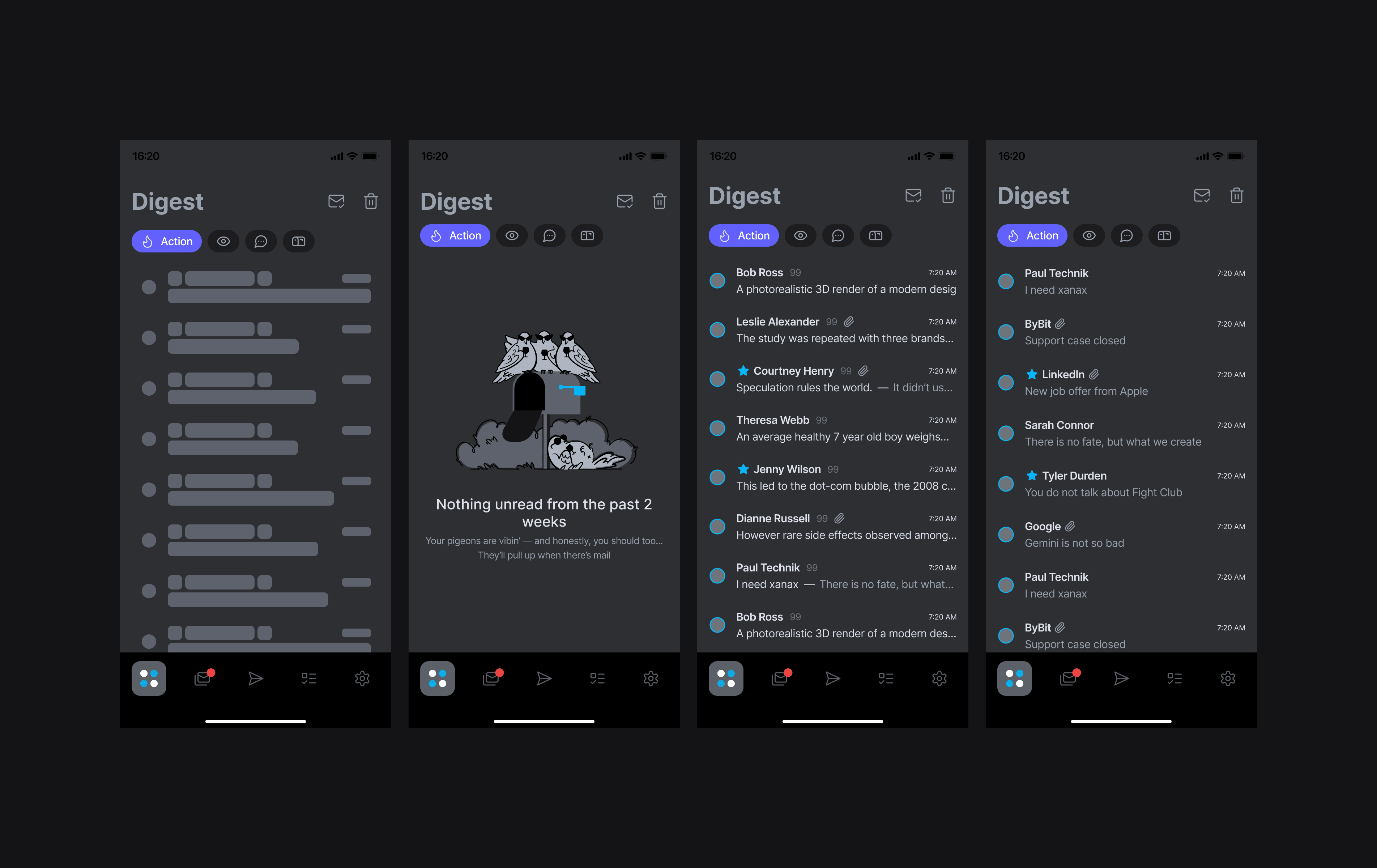
Since the primary focus of the application is the daily digest, let's concentrate on that. Although, in addition to it, we also redesigned the section for suggested to-do tasks, added categorization, and introduced gamification with progress tracking. But for now, we are only concerned with the digest.
For the digest, I created an entity called a "digest item." This item contains a brief snapshot of the content from the email threads and conversations attached to it. At that time, we faced a problem where a single "digest item" could combine several different threads that the AI models identified as a single event. This is precisely why I had to add a tabbed interface with sender names as tab titles in the email preview.
I packaged the "digest item" itself into a separate frame, making them easily distinguishable for both development and the end-user (initially, the LLMs simply provided us with plain text containing anchors linking to the threads used for the summary).
During the period when this screenshot was relevant, we were testing a hypothesis about highlighting important emails by increasing their size. (The correct answer: it's not adequate at all.) In this approach, new important emails would replace previous ones in the list, which confused users. Plus, at that time, we couldn't get the neural networks to consistently generate the same cover text for each individual "digest item."

So, the results of the changes in numbers:
CES
6.91 (69.6% 6-7)
8.97 (72% 9-10, 93.8% 8-10)
8.06 (Over 90% of customers reported a positive experience)
9.0 (90.9% of customers are "Promoters" 9-10)
CSAT 36%, NPS -53
Even after successfully resolving the main pain points identified in surveys, users remained hesitant to recommend our app. The consensus was that it felt too complex and unfamiliar, despite praising specific features like the scalable email preview summary. This feedback led me to undertake a full-scale redesign of the UX and workflow — a decision that ultimately validated my initial intuition
Final result
A lot more work went into this after that, which I can detail in person. The final results are below. This was a collaborative team effort, and I'm thrilled that the actual data ended up having more influence than anyone's personal ideas.


CSAT 97%, NPS +100
Design System: Scalability and Semantic Architecture


Once the product logic crystallized, I transitioned to building a comprehensive design system. This wasn't merely a visual cleanup — it was a strategic investment to drastically reduce Time-to-Market for all future features.
Semantic Tokenization
I moved away from traditional color naming like blue-500. Instead, I implemented a robust semantic token structure. Here is why this was a game-changer:
Logic over Names: Colors are named by their function, such as action-primary-active or background-surface-elevation. This allows us to rebrand or adjust the entire app palette in minutes without losing track of individual shades.
Seamless Theming: Leveraging Figma Variables, I built a dark mode that functions as a parallel logic layer. I didn't just invert colors; I mapped tokens to ensure visual hierarchy remained consistent.
Accessibility Control: I manually calibrated contrast for the dark theme. While I respect WCAG guidelines, I adjusted specific shades based on real-world readability and eye strain reduction, ensuring a superior user experience in low-light environments.
Component-Driven Development
For the MVP, I developed a library of reusable components where every element — from basic buttons to complex digest cards — has defined states and interaction rules. This enabled the front-end team to assemble new screens like a construction set, freeing me from pixel-pushing and allowing me to focus on high-level product strategy.
Design, web and mobile apps
It all started with simple rock paintings and initial ideas about how it should work and look. The first low-fidelity prototypes appeared, becoming more modern and convenient with each iteration. This process is similar to that of a sculptor who takes a piece of rock and chisels away everything that is not needed. Occam's razor is always important to me when designing, and only business needs can lead me to complicate a particular element. After 3 months, we had the first high-fidelity layouts with detailed descriptions of the interactions. A month later, everything was set up and tested, except for the backend, which needed to be developed.

Visual Identity and Art Direction
A complex professional tool shouldn't feel clinical or exhausting. To differentiate Noetro from sterile corporate software, I stepped into the role of Art Director:
Illustrative Language: I curated a series of unique illustrations, moving away from dry metaphors toward playful and ironic imagery.
Emotional Design: I turned empty states into moments of engagement. Instead of frustrating the user, these screens provide a brief mental break, which is crucial for retention in a high-cognitive-load environment.


Some interesting features
The most interesting thing about our new approach to working with email through a mobile app is the way we present the information. If you have a paid account, you see a so-called "Noetro view" in your inbox, which shows a detailed summary for each email. You can scroll through these summaries like cards, and if you want to switch back to the classic view, you can do so with just one tap.
Another interesting feature that came to mind is the link to the original email message that created the task in the To-Do list. This is available in both apps, so you can quickly see the rest of the email and possibly edit the task. Overall, Noetro is packed with interesting features, and we've tried to make interactions easier, faster, and more convenient at every step. I'll tell you more about this next time or in a private conversation.
Future plans
In the future, we plan to continue improving our app and adding new features to make it even better. We value your feedback and want to hear what you think about Noetro. Let us know if there's anything else we can do to make your experience more enjoyable. First and foremost, it's product market fit research. It's important for us to gather all the possible feedback, launch tests with new iterations, and make sure we hear everything clearly and that we are heard in return.
Here are a few ideas from our backlog:
• Automation of tasks for integrating with other platforms
• Sorting emails into different folders based on the current context
• An assistant for intelligent automatic responses (e.g., when you're out of the office)
• Smart notifications based on relevant content with short descriptions indicating important messages or those related to specific fields
• "After-vacation mode"
• Integration with keyboard shortcuts
• Expanding your to-do list to improve productivity with a calendar
• Smart search from your inbox
• Adding team collaboration features
• Integrating with additional email providers
• Ability to work with multiple email accounts
• Meeting security requirements at the enterprise level
• Improved data collection and analysis
• Automated response suggestions
I'll explain more when we meet in person. See you then!
Alexey Yarkin © 2026